Breakpoints introducation (Part1)
Nowadays, creating fluid layouts is not just about using fixed-width breakpoints; it's about designing layouts that work well on different device sizes. It's surprising that some websites still use adaptive design with a container that changes its max-width based on the viewport width. The term "Breakpoints" has evolved to include media queries that consider user preferences and modern CSS features that allow for fluid layouts without media queries. It's an exciting time for responsive design.
When the term "Breakpoints" comes to mind, I immediately associate it with various device sizes, and I'm sure many others feel the same way. However, the meaning of responsive design has evolved and now encompasses many different aspects. Some designers still believe that responsive design involves creating two versions of a website, one for desktop and one for mobile, which is an outdated approach. Let's examine a design that requires a Breakpoints.
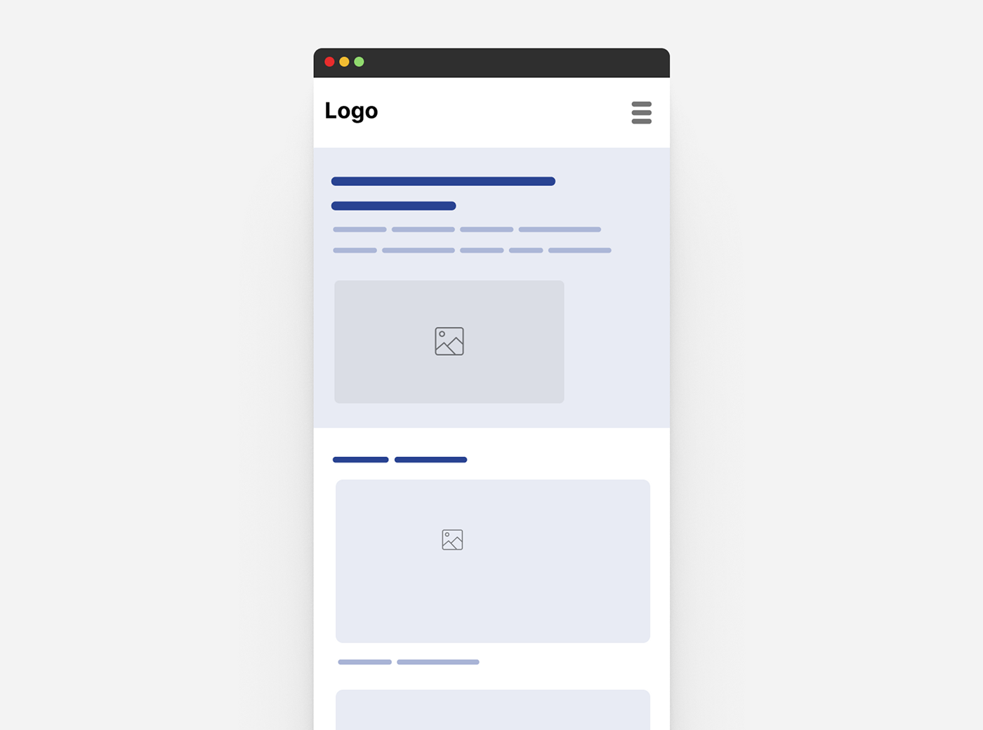
Let’s see this example: here’s a typical layout for a website

Most of designers will think of:
1. Decrese font size
2. Change the cards to Viertical layout
2. Change the cards to Viertical layout
However, a frontend designer might ask:
1. At what point should the Title (Header) and image wrap to a new line?
2. Is the font size adjustable or fixed?
3. What Aspect ratio should I follow for the Image?
4. Should I use fluid spacing?
4. Should I use fluid spacing?
5. Card listings: should it be displayed in different variation sizes between mobile and desktop, using size container queries?
6. Will any UI details change based on the user's preferences, such as reduced motion or theming/color scheme? ..etc
To be continued ..
------
Example of Breakpoints:
Follow this link and you can play with some real media queries I set up for you:
https://codepen.io/iammohab/pen/vYayWbZ
https://codepen.io/iammohab/pen/vYayWbZ

